Lesson 4 - Directing the Eyes/Alignment & Grids
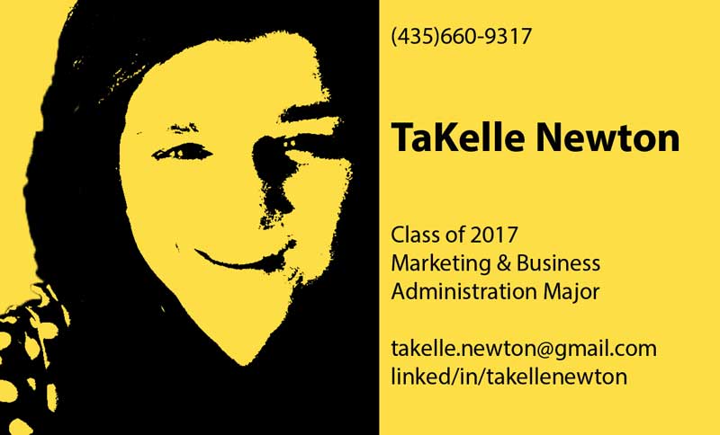
Inspired by pop art, I created a business card with bold color and a stenciled personal touch.
Photoshop Skills Used:
Design Thoughts:
Resources:
Image Source: TaKelle Newton, selfie
Photoshop Skills Used:
- Adjustment Layer with solid color
- Quick Selection Tool
- Threshold Adjustment
- Gaussian Blur- 0.5 px
- Curve Adjustment to image- S curve
- Gradient Map
- Smart Objects
- Text Tool
- Grids
Design Thoughts:
- Created a new layer, adding an adjustment layer with solid color between the original and the new layer
- Used the quick selection tool to de-select the background of the image and delete it
- After changing the color of the image to monochrome (taking away color-but grayscale), I applied threshold adjustment at level 128 to simply get the image in black and white
- Applied Gaussian blur (with radius at 0.5px) because the image was pixelated and not what I wanted
- Since the image appeared at low quality, I applied a curve adjustment to the image to improve it; S-curve
- To change the background color of image- I used a gradient map
- Used the ‘imaginary box’ technique for the business card and added text; matching the background with the background color of the picture
- Alignment and Grids- image right aligned and text left aligned
- Smart objects were used throughout the Photoshop process to ensure the quality of the image
Resources:
Image Source: TaKelle Newton, selfie
