Lesson 5 - Proximity, Space, Unity
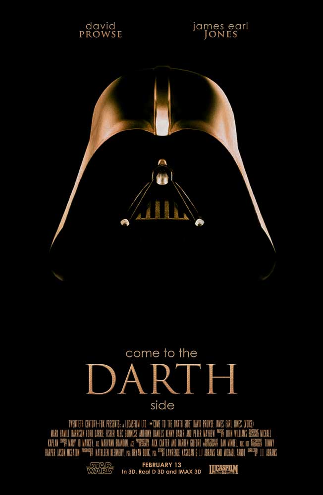
I wanted to explore with the design principle of less obvious content; considering I find this difficult to accomplish and abstract. I decided to create a movie poster, where viewers could easily fill in the missing details based on prior knowledge of familiar objects. Using Darth Vader as the focus; I only left the necessary details to make out who the character was. The design uses proximity, space, and unity.
Photoshop Skills Used:
Design Thoughts:
Resources:
Image Source: Darth Vader
Logo Source(s): Lucus Film Logo ; Star Wars Logo
Photoshop Skills Used:
- Layer Tool
- Clipping Mask Tool
- Brush Tool
- Levels
- Hue/Saturation
- Text Tool; styles
- Ruler
- Grids
Design Thoughts:
- Created a layer, filling it with black (inverse) to create the background
- Added the image and created a clipping mask
- Using the brush tool, I cleaned up the image allowing it to blend into the background
- The Levels Tool was used to adjust the input levels
- Adjusted the Hue/Saturation Levels: (Hue +180/Saturation -2) to make the image richer/warmer in color
- Added text using the following fonts: Promenade De la Croisette Regular, SteelTongs, Century Gothic, and Trajan Pro
- Styled text by applying the following: Bevel and Emboss, Inner Glow, Gradient Overlay, and Drop Shadow
- A play on word was used in the tagline “Come to the Darth side” to reference the character, Darth Vader
- Alignment and Grids- 8 columns used; text center aligned
Resources:
Image Source: Darth Vader
Logo Source(s): Lucus Film Logo ; Star Wars Logo
